Introduction
Iterations Showcase
For this project, I was hired by the ACC Visual Communication department to design the digital assets for the 2024 Graduate Showcase. These assets included two stages of a website, an email banner, social media posts, and a slideshow template. I collaborated with another designer that was hired to design the print media and overall aesthetic of the show, basing my work off of their design system.
Key Project Data
Role: UI/Visual Designer
Tools: Figma, Adobe Illustrator
Design Process
Working with a Theme
When I stepped in to work on this project, a distinct visual identity had already been established for the show. Working with another designer, the client had picked the theme of the show, Iterations, and work on the main poster design of the show was in the works.
It was my job to adapt the design theme of the show into the first stage of the website which would include show details such as location and time. This is the website that would be sent out to industry professionals, family, and friends to inform them to save the date. Having sat in on meetings between the client and the print designer, I had a good grasp of the theme of the show and the direction that each party wanted to take the design.
I faced a couple of challenges at this point in the design process — staying on theme with the original design of the show, adapting the design for a responsive environment, and designing for both mobile and desktop.
Stage One Website
My first step in designing the stage one website was beginning with the mobile version of the site first. The layout of the first stage of the website was very simple — a hero image with the show details below — so I started by adapting the poster design into a mobile-friendly design. I created a typographic system for the mobile version of the site and re-created the design of the poster at the proper scale for mobile screens.
After the mobile version of the design was established, I moved on to the desktop version of the site. This was a bit more challenging to adapt since the poster design was fairly vertical and the average screen size for desktops is more horizontal. I ended up removing and rearranging some of the design elements to fit a wider aspect ratio. I also had to account for the responsiveness of the web, so I designed a version of what the design would look like at wider aspect ratios.
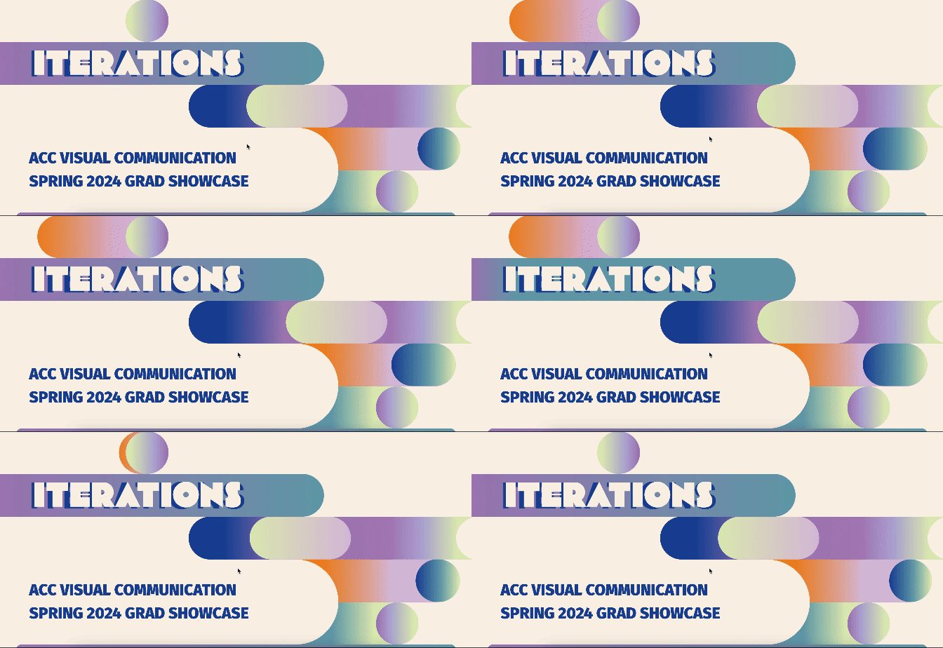
Once the theme of the show had been established, I knew that I wanted to incorporate some type of animation or motion into the design to emulate the idea of a process of iterations. Using the Figma smart animate feature, I created a mockup of the motion I wanted for the main design of both the mobile and desktop versions of the site.
Stage Two Website
The second stage of the website included a grid of cards that linked to the graduating students’ portfolio websites. The hero image would stay the same, but I needed to design the student cards, including all of their interaction states.
Keeping accessibility in mind, I designed different interaction states that would be obvious to users who are color blind. I used different colors with very obvious shifts in contrast, even in black and white, as well as size changes for the cards. I then created an interactive prototype mockup of the interaction states, so they would be clear for the developer.
Other Digital Assets
Social Media Tiles
I created a few options for the social media tiles — one with more information on it and a few without as much information that experimented with iterating on the design of the theme a bit more. The client had told me they would include the important information of the show in the social media post details, so I had options of how I wanted to display that information. They ended up liking all of the designs and utilized all of them.
Email Banner
I had an initial design for the email banner that was asymmetrical, but upon considering how it may be used in an email chain, I also designed a more symmetrical option.
Slideshow Templates
Finally, I designed a slideshow template for the UX student presentation schedule and a slide that showed information about the student currently presenting.
Final Design
Reflections + Takeaways
It was challenging working with an existing design system that was not of my own design. I had to strike a balance between adhering to the rules of the existing system while also using my own creativity to create interesting designs. I learned the importance of clearly communicated rules, both as someone who had to follow them and as someone who might be asked to design them in the future.
Challenges
I learned a lot working on a project with a real client and a live website as a final product. Most important was that I had to be very intentional and clear with my design file, as it was handed off to the developer. I had to make sure the developer could understand my intentions, either with clear design decisions or annotations, so that there weren’t delays in the final process of converting my design into code.


