Introduction
TripBook App
For this project, I was tasked with creating the visual design for an app that helped users keep track of artifacts from their various travels. This app needed to be highly flexible to allow users to make it their own and included a light and dark mode. Additionally, the app included a “Year in Review” section that allowed users to understand their numeric information that was gathered by the app. This meant I was responsible for making quantitative data visualizations that were both accurate and interesting for the user to look at.
Key Project Data
Role: UI/Visual Designer
Tools: Figma
Ideation
Research
The first step of my process in designing the TripBook app was research. I looked into the patterns of other apps that had light versus dark modes to see how they were executed. One thing I noted was that relative contrast across the two different modes was generally maintained. This was something I would keep in mind when designing my two different modes.
I also researched interesting data visualizations to get ideas on how other designers used motion and graphics to convey data in a compelling way.
Sketches
After researching similar apps and data visualizations, I moved on to the sketching phase of my ideation process. I drew out numerous quick, low fidelity sketches to stimulate the flow of ideas and iterate on multiple different layout concepts.
Mood Boards + Style Tiles
Next, I began crafting the aesthetic direction the project would go in. I started by creating two mood boards that represented two different directions the design could go in. The first was full of warm, bright colors that were reminiscent of daytime and blue skies. The second was more inspired by the sunset, with cooler, darker colors.
I also created style tiles of each of the boards to give a better idea of what the mood board would look like in practice. These included both light and dark versions of the color scheme.
After presenting these two options to the client, we decided to move forward with the second, sunset option of the mood boards. This helped inform me of the general aesthetic and mood that the client was aiming for, and guided my design decisions going forward.
Design Process
Wireframes
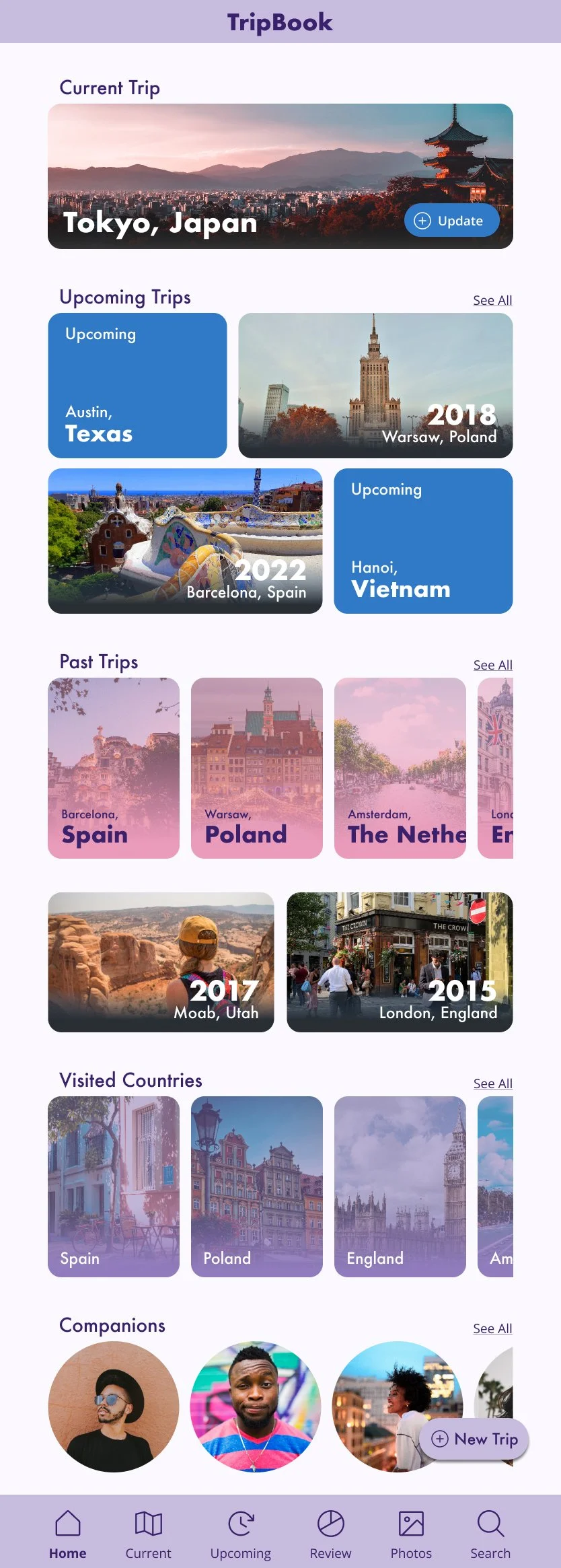
Now that I had the general aesthetic established and some layout ideas, I began adapting my favorite sketches to wireframes. I wanted to avoid too simple and repetitive of a layout of just side-scrolling cards in a line down the page, so I incorporated widgets that would be images taken from the user’s photo albums of various trips. These would serve to break up the page and spark joy in the user as they were scrolling down the main interface. I also changed the shape of the different modules, such as making the Companions circles, to add variety to the layout. I used rules of proximity and similarity to organize the different modules on the page and make it clear to the user which sections belonged together.
Visual Design
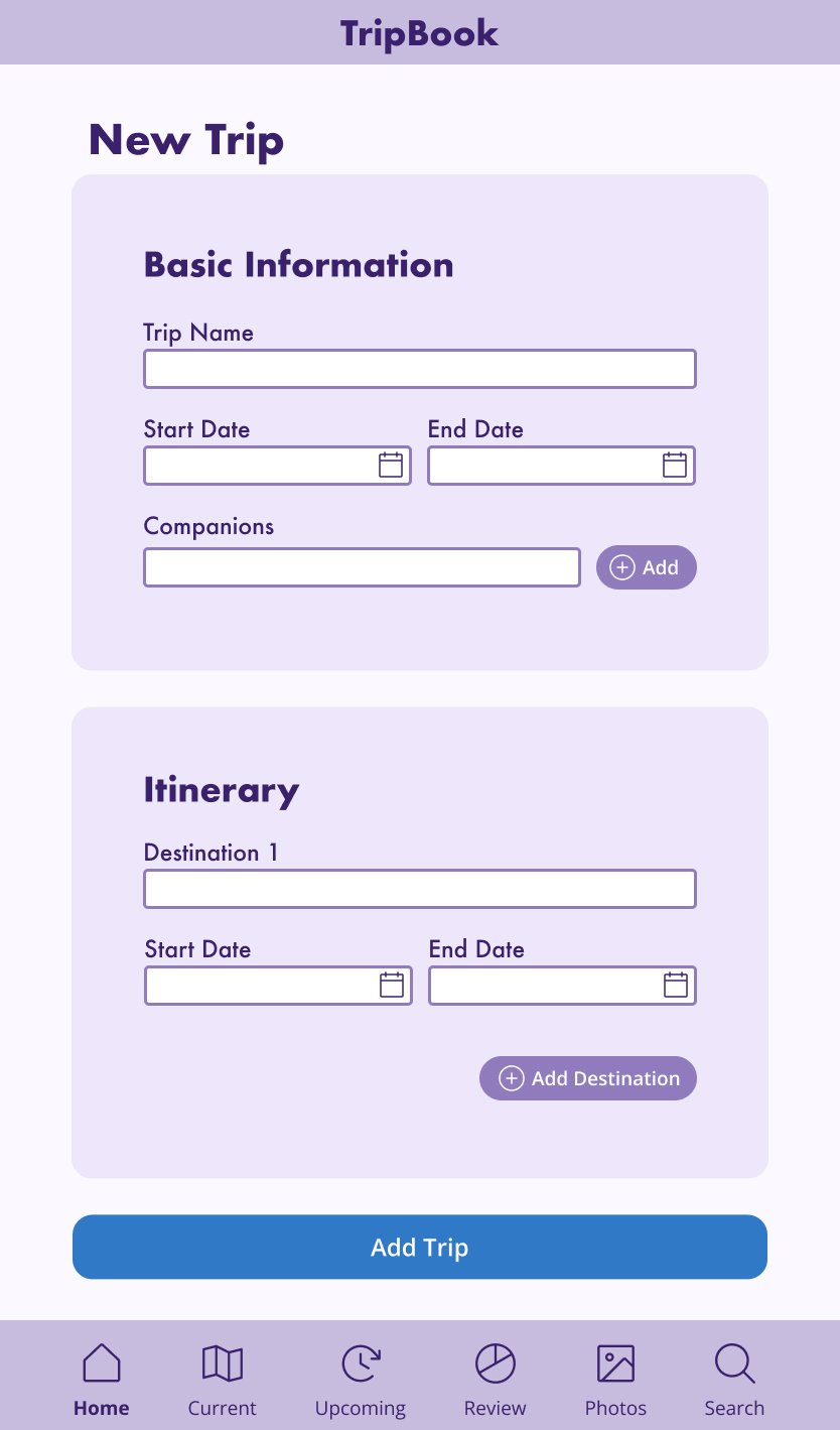
After my wireframes were established, I moved on to the visual design process where I would add color and personality to my designs. Basing the design on my mood board and style tiles, I attempted to recreate the aesthetic that was established there into the app design. TripBook’s design was meant to be clean, modern, and approachable. I utilized a sans serif font to convey that sense of modernity, and incorporated the sunset color palette of the original style tiles into the design to establish the brand’s personality.
Challenges
I encountered some challenges here, such as making the color scheme across the light and dark versions of the app have similar amounts of contrast. I solved this by creating a palette of shades and tints in both the light colors and the dark colors, then using the same relative shade or tint for each respective element.
Another challenge I faced was establishing a rule for how the text would behave in each of the modules if the name of a trip was longer than the length of the box. I experimented with a few different options, such as letting the text extend and get cut off by the edge of the module or decreasing the font size to fit in the box. I decided against decreasing the font size for accessibility and consistency purposes. Ultimately, I settled on a combination of having the text stack to a second line and extend through the length module if it still didn’t fit on two lines.
Data Visualization
Presenting Data
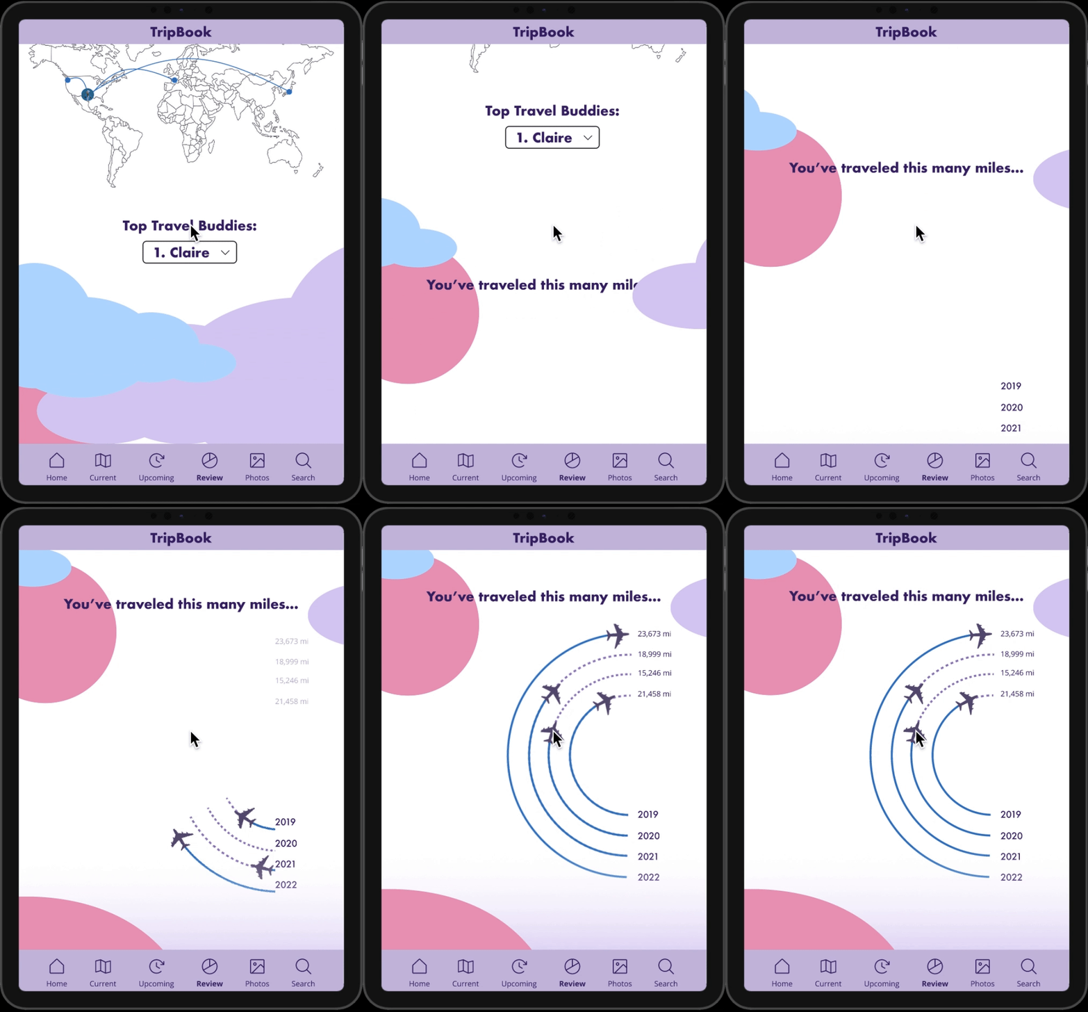
A key part of this project was the “Year in Review” section of the app, which collected data about the user’s travels and presented it to the user in unique and interesting ways. I used a combination of different charts and graphs with animation effects to display this information to the user.
Final Design
Reflections + Takeaways
Accuracy First
One thing that I learned from this project was the importance of clarity to the user. In designing my data visualizations, I had to make sure I was presenting the data to the user in an accurate and easy to understand manner. While I also wanted to make the “Year in Review” fun and interesting for the user to look at, it was most important that the information was portrayed accurately. For example, I had to choose the right type of graph for the information that I was presenting. Then, after deciding the best method of presenting that information, could I ideate on ways to make it interesting and unique.


